How Color, Composition & Style in AI Portraits Boost Clicks and Trust
This image was created in the BlendMe.ai app.
Why color, composition and style in your portrait matter (and how AI helps)
First impressions online are almost entirely visual. Whether you want more clicks on LinkedIn, better matches on dating apps, or higher engagement on Instagram, subtle choices in color and composition move the needle. Tools like BlendMe.ai make it fast to experiment with those choices by generating polished AI portraits, smart edits, and short image-to-video clips tailored to your brand.
In this article you'll learn simple, research-backed rules for color and composition, practical A/B testing ideas, and step-by-step tips for using AI portraits to boost trust and click-throughs—without losing authenticity.
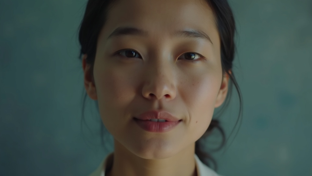
Why color and composition affect perception
- Color influences emotion: blues are associated with competence and calm; warm tones (reds, oranges) feel energetic and approachable.
- Composition drives focus: eye-line, head tilt, and negative space determine where viewers look first and how long they stay.
- Style signals context: a business-formal headshot conveys authority; a candid lifestyle shot reads approachable and creative.
A quick stat to keep in mind: profile photos that feature a clear face and uncluttered background see substantially higher engagement across platforms. That’s because viewers can instantly read facial cues and context.
Which feature to prioritize in BlendMe.ai
Focus on two features first:
- AI Portrait Generation — train a personalized model with 10–20 photos and generate consistent, high-res portraits in any style.
- Smart Editing — tweak background colors, lighting, and outfit style without manual retouching.
These let you test color palettes and framing at scale: generate versions with different backgrounds, outfits, and crops, then compare performance.
Practical rules of thumb for different goals
- LinkedIn / Professional: choose muted, cool backgrounds (soft blue/teal), three-quarter crop, slight smile, direct gaze. Use a clear, shallow depth-of-field so the face pops.
- Personal Website / About page: warmer tones and medium framing work well. Use a subtle background that echoes your brand color for cohesion.
- Dating / Social: brighter, personality-driven palettes (golden hour tones) and varied compositions (full-body or lifestyle shots) increase relatability.
- Creator / Portfolio: be bold—artistic color grading and creative backdrops reinforce a unique visual signature.
💡 Tip: Keep a “primary” and “secondary” palette. Primary is the main background/outfit tone you use across profiles; secondary is for seasonal or campaign variants.
Mini workflow: test 6 portrait variants in a week
- Generate a core portrait in three background colors (blue, neutral gray, warm gold).
- For each, create a cropped LinkedIn version (head and shoulders) and a wider social version.
- Add one micro-video thumbnail from a still (subtle movement) for your top-performing background.
- Run A/B tests: use LinkedIn analytics, Instagram story taps, or dating app swipe rate as your KPI.
This structured, iterative approach favors data over guesswork and is fast with AI-powered tools.
Composition decisions that increase trust
- Eye contact: direct but relaxed eye contact typically conveys competence.
- Head tilt: a small tilt (5–10°) can read as approachable; straight, level chin reads determined.
- Rule of thirds: place the eyes near the top third line to create pleasing balance.
BlendMe.ai’s portrait generator and edit tools let you dial these precisely—generate multiple versions and pick the one that matches your intent.
Use cases and quick scenarios
- Freelancer pitching clients: use a professional portrait with a brand-colored background on proposals and bios—consistency conveys reliability.
- Job seeker: a cool-toned LinkedIn headshot paired with a short micro-video intro increases profile views and perceived approachability.
- Creator planning a launch: create a bold, stylized hero portrait and a set of complementary social images in the same color family.
Privacy and authenticity considerations
When experimenting, pick real photos to train your model and avoid over-stylizing to the point you’re unrecognizable. BlendMe.ai processes uploaded photos securely and builds a model that’s yours—helpful if you want realistic, consistent likenesses across styles.
Quick checklist before you publish a portrait
- Does the color palette support the message you want to send?
- Is the composition focused on the face and eyes?
- Does the style match platform expectations (formal for LinkedIn, organic for Instagram)?
- Have you created both a still and a short micro-video version for multi-platform use?
Final thoughts: build a small visual experiment loop
Start small: pick two core colors, generate 4–6 portrait variants with BlendMe.ai, and measure which ones get more clicks, profile views, or replies. Over a month you’ll gather real data about how color and composition impact engagement. That empirical approach wins over gut instinct.
Ready to take your visuals further? Download the app and start generating portrait and micro-video variants that match your brand and goals.